Fundraising Event Website - Large-Scale Cycling Program

Overview
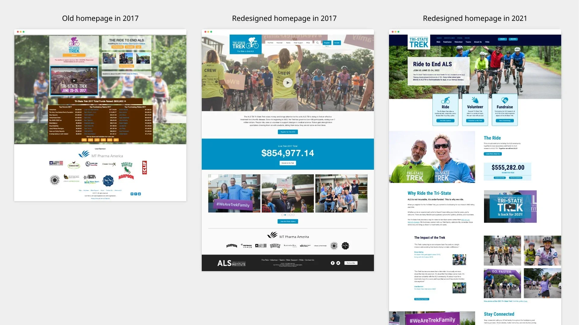
Tri-State Trek is ALS TDI’s largest annual fundraising event, raising more than $10 million for ALS research. I redesigned the event website to better reflect its impact, simplify participation, and help cyclists, donors, and volunteers easily register, fundraise, and prepare for the multi-day ride.
Key Challenges
A cluttered, confusing website that didn’t reflect the scale or impact of the event
Important details (dates, fundraising minimums, participation options) were difficult to find
Event resources were scattered, making it harder for participants to succeed
My Role
I served as the sole and lead UX/UI designer, focusing on clarifying information architecture, improving usability, and incorporating participant feedback to create a more intuitive and supportive experience for event participants.
Users
Cyclists registering and fundraising for the event
Donors supporting riders and ALS research
Potential volunteers
User-Centered Design Highlights
Synthesized participant feedback into actionable insights:
Hidden Information: participants communicated that important information, like event dates and fundraising minimums, takes too much time to locate on the website
Central Resources: participants need easy access to resources and tools for fundraising and training so they can succeed
Information architecture redesign to surface critical event details

Paper and digital wireframes to explore clearer layouts and workflows

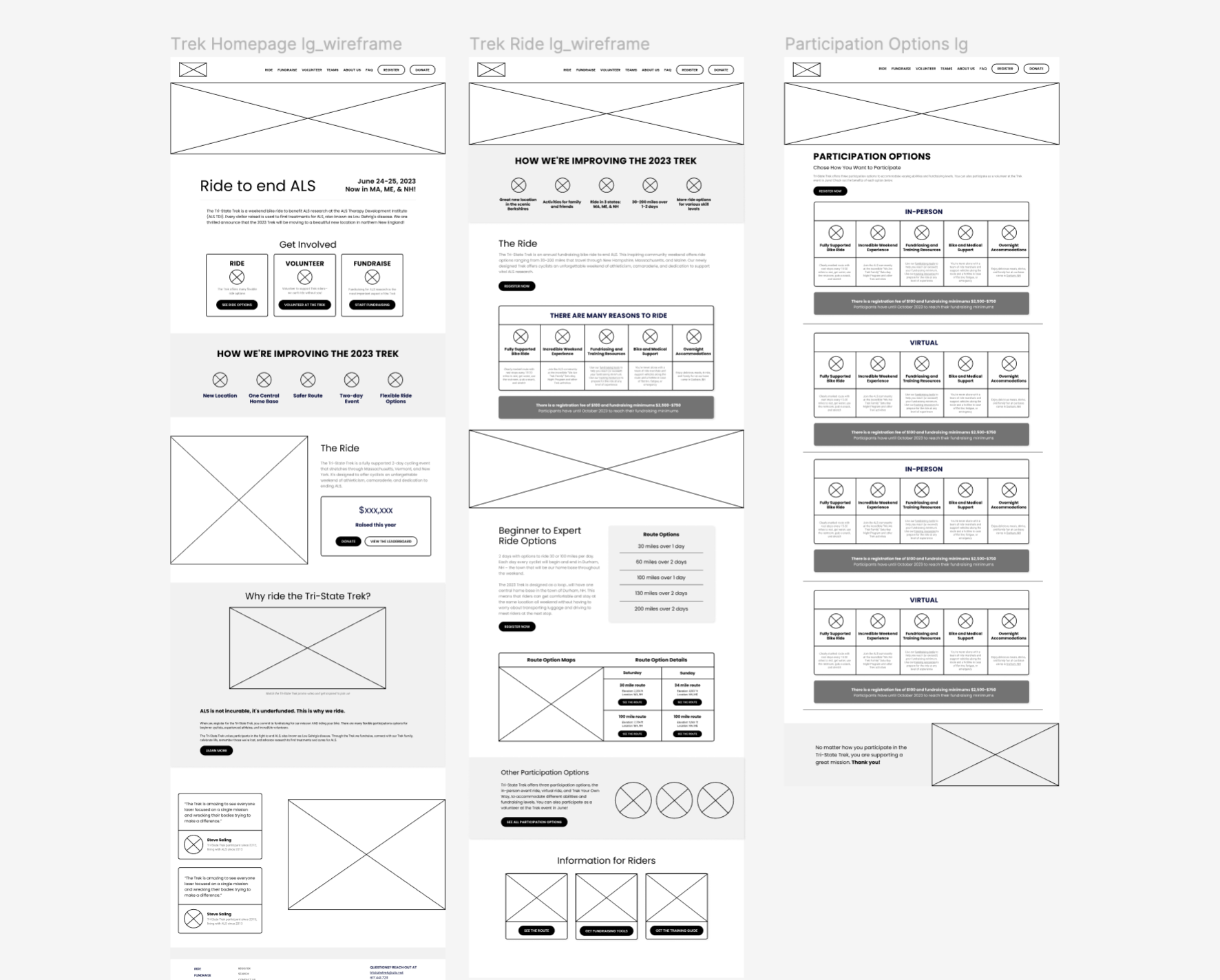
Design Solutions
Clear participation options presented in structured tables so users could quickly compare benefits, fees, and requirements
Centralized resource hub for training, fundraising tools, and route information
Prioritized in-person riders by organizing the most relevant guidance and support materials

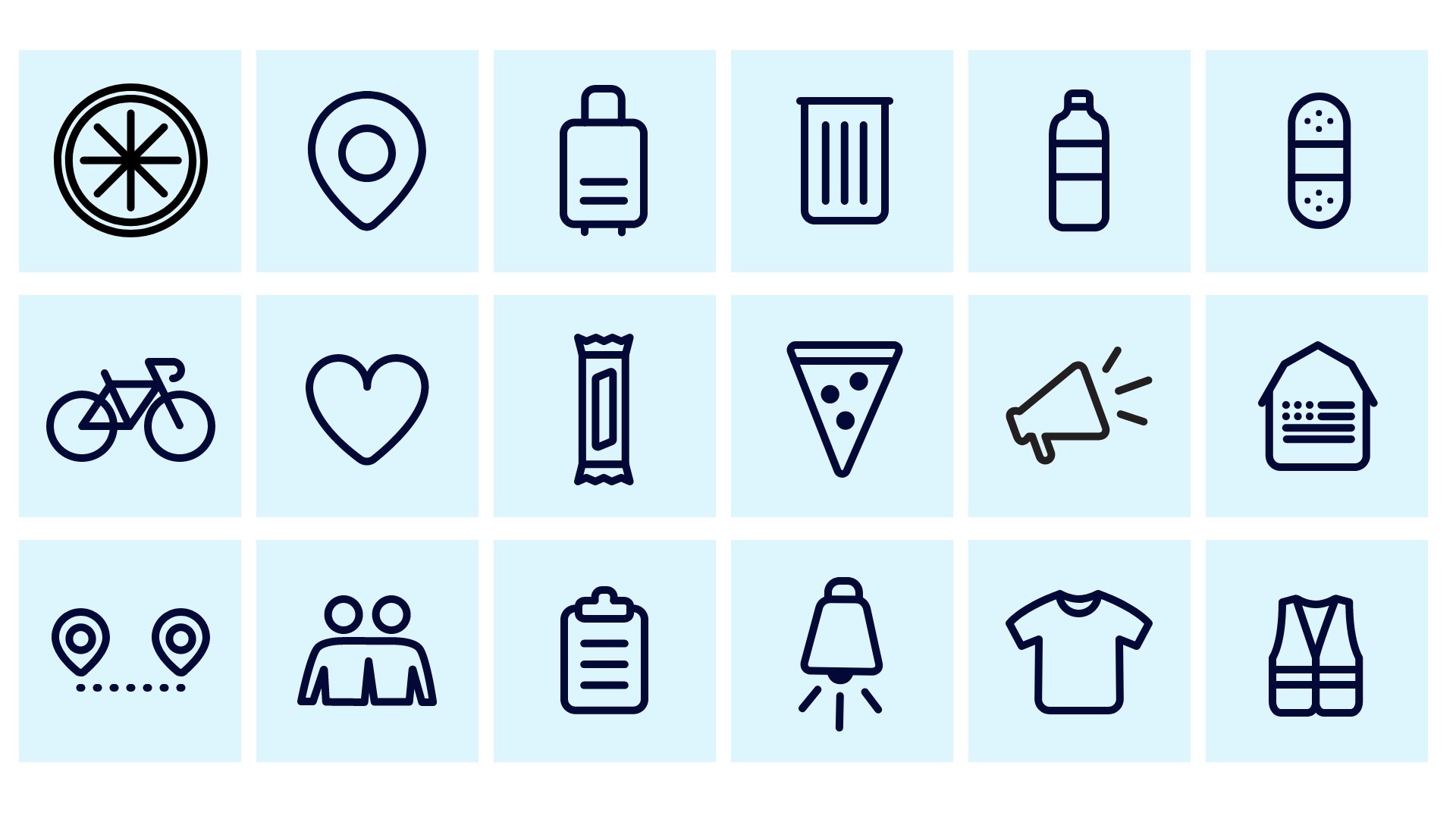
Lightweight, branded design system in Figma with a custom icon set

Deliverables
Responsive Figma UI designs, prototypes, and annotations for developer hand-off
Lightweight design system and custom iconography
Other branded promotional materials


Outcomes
✓ Improved registration experience that increased conversion from interested visitors to registered participants
✓ Reduced time to find critical event information (dates, fundraising minimums, participation options), based on participant feedback
✓ Centralized resources helped participants more easily meet fundraising and training requirements
✓ Contributed to continued growth of the event, supporting an annual fundraiser that has raised $10M+ for ALS research
✓ Increased engagement with fundraising and training resources following the redesign
What I Learned
Clear, enjoyable user experiences directly support fundraising growth
Designing for multiple user groups requires prioritization and thoughtful content organization
Incorporating real participant feedback leads to more efficient and effective event experience