ALS Research Portal - Disease Progression Monitoring
Overview
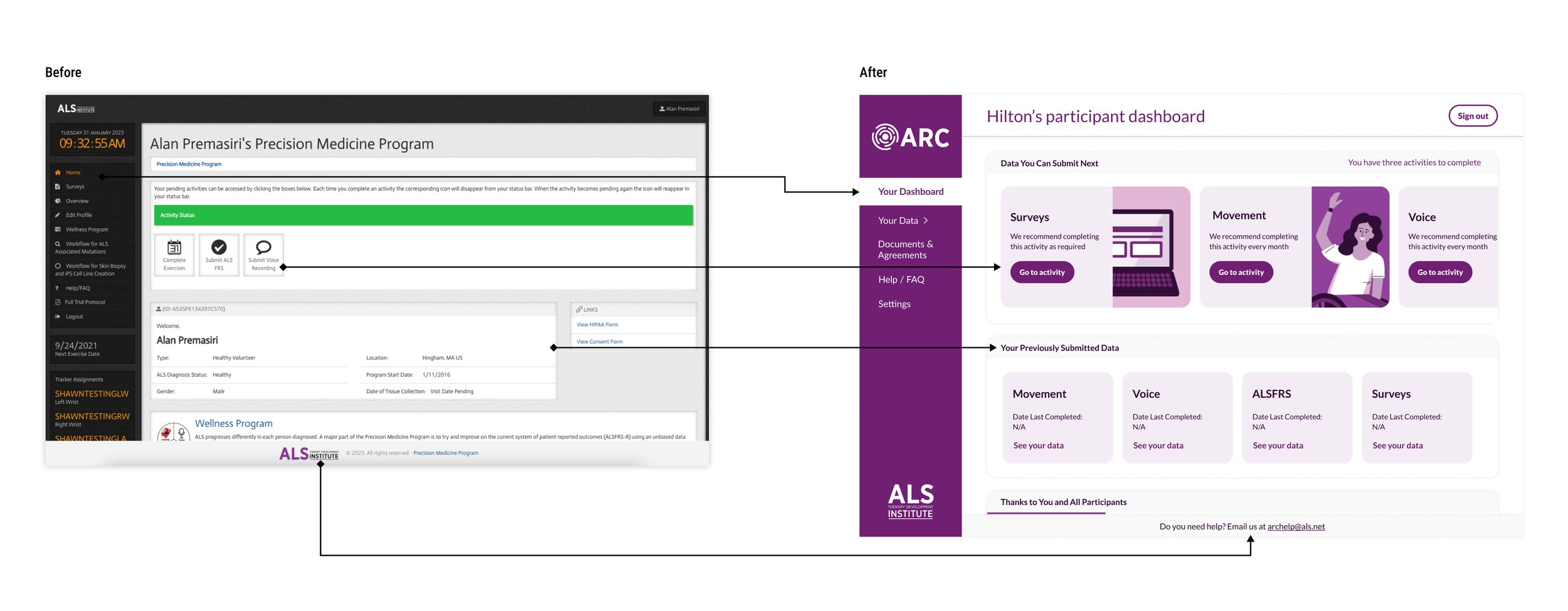
I led the end-to-end redesign of the ARC study’s enrollment and participant portal, creating an accessible, multimedia workflow for more than 800 individuals with ALS who are study participants. The new design simplified complex processes, reduced cognitive load, and improved usability—resulting in a 20% increase in enrollment completion within four weeks.
User Interface
Responsive Website
User Experience
Motion Design
Cross-functional Team Collaboration
Illustration
Brand Identity
The Challenge
Transform complex enrollment requirements and participant data into a clear, intuitive experience that supports user understanding and decision-making.
Additional Challenges:
Streamline the enrollment flow to reduce friction and drop-off
Increase participant enrollment through a more guided, user-friendly process
Strengthen communication touchpoints throughout the participant journey
Establish a cohesive and trustworthy brand identity for the ARC program
Follow research study protocols
My Role
As the sole UX/UI designer, I led the end-to-end redesign of the ARC participant experience. I collaborated with clinical experts and gathered ongoing feedback from ALS patients and caregivers to ensure the design met real accessibility needs. I produced all UX and UI deliverables, created custom illustrations and an animated explainer video, and worked closely with the development team to provide specs and guide implementation. My role covered research, strategy, interaction design, visual design, and cross-functional communication.
Users and User Needs
The primary users were individuals living with ALS, many of whom experience limited mobility, fatigue, and cognitive strain. These factors made traditional, text-heavy or time-consuming digital experiences difficult to complete.
Through interviews and observational feedback, users consistently expressed the need for:
Reduced cognitive load during long or complex workflows
Clear, step-by-step guidance to help them understand eligibility, next steps, and study expectations
Flexible stopping points so they can pause and resume tasks as needed
Progress indicators that help them anticipate the time and effort required
Multi-sensory options (audio, video, and text) to accommodate different mobility and comprehension needs
A centralized home base to see tasks, access data, and stay informed without searching through multiple systems
These insights shaped every decision in the redesign.
User-Centered Design
The project followed a highly iterative, research-driven approach:
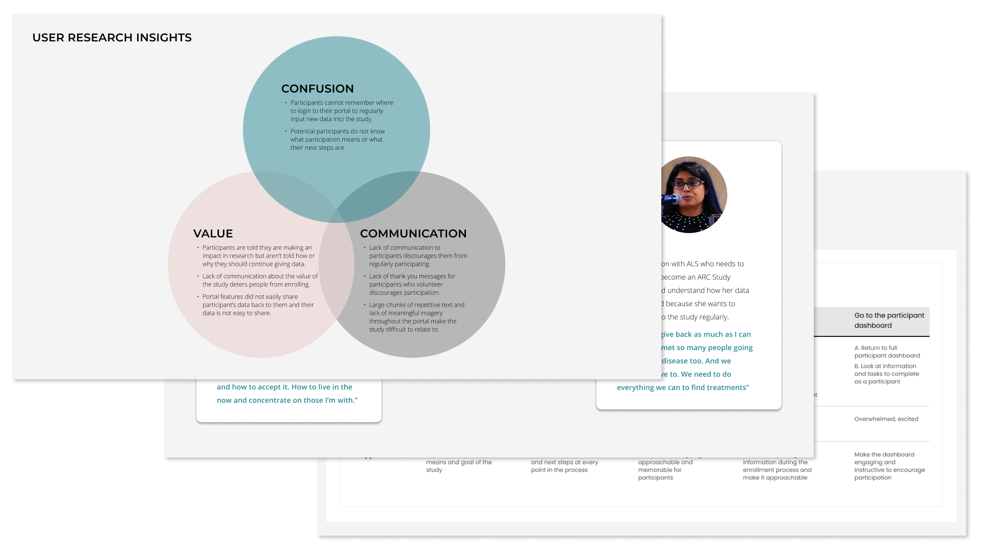
1. User Interviews & Research Synthesis
I interviewed ALS patients and caregivers to understand enrollment challenges, accessibility barriers, and motivational factors. I conducted affinity mapping to identify patterns around pain points, emotional responses, and unmet needs to create personas and journey maps.
2. Heuristic Evaluation & IA Restructuring
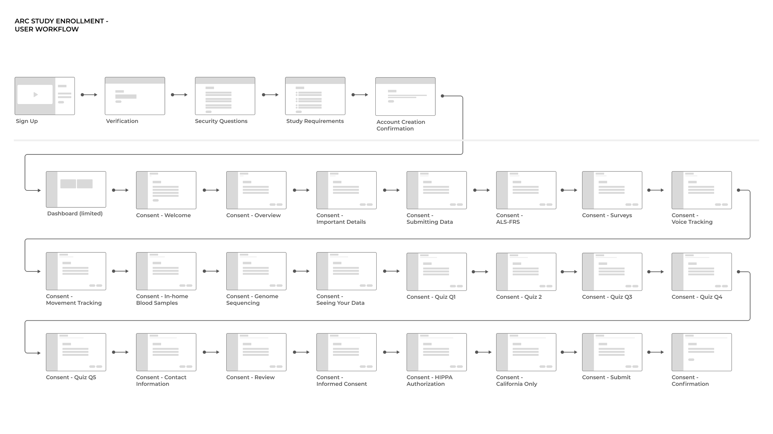
I audited the existing platform and processes for usability issues and accessibility gaps, then restructured the information architecture to simplify navigation and reduce cognitive load. I also worked with my team to create a new, streamlined workflow for enrolling that met the technical requirements of enrolling in the research program and was digestible for users.

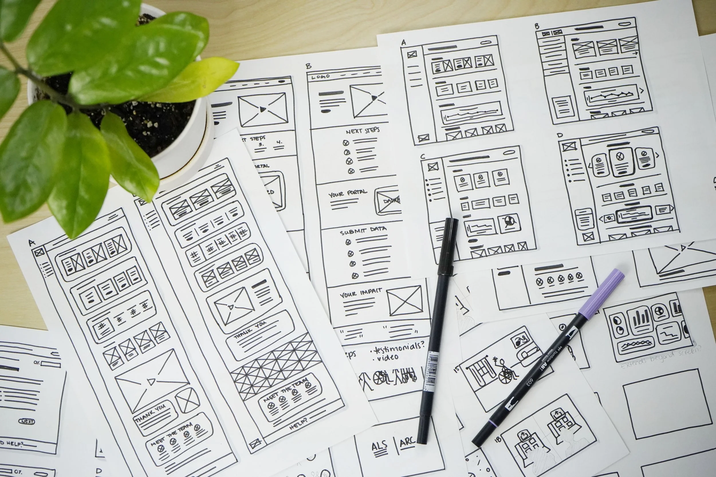
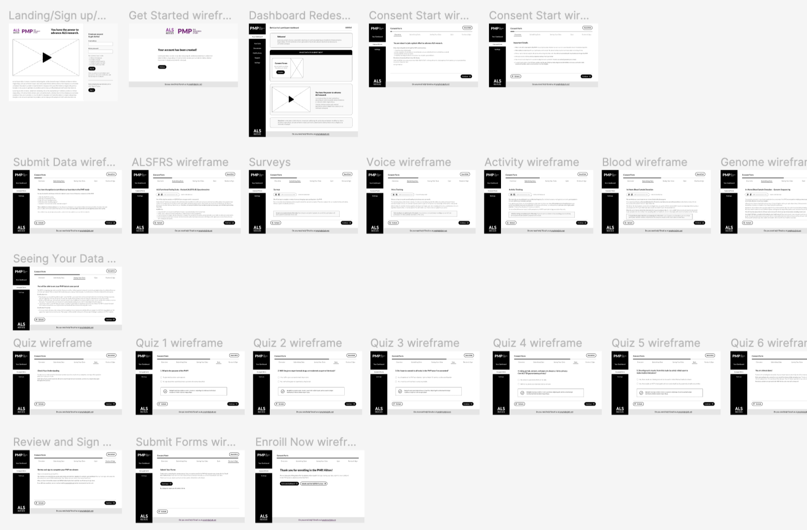
3. Low-Fidelity Prototyping
Using paper and moving into Figma, I developed low-fidelity wireframes to validate early concepts. These prototypes were reviewed with patients, caregivers, and study experts to ensure clarity, accessibility, and accuracy.
4. Iterative Design Reviews
Feedback loops were built into every phase. I tested early flows with users, gathered qualitative insights, made revisions, and repeated the process across multiple rounds of refinement.

5. High-Fidelity Designs & Handoff
After validating mid-fidelity prototypes, I executed polished UI designs and documented interaction specs. I worked directly with developers to troubleshoot feasibility questions and ensure alignment through implementation.
Design Solutions
Streamlined and Supportive Enrollment Experience
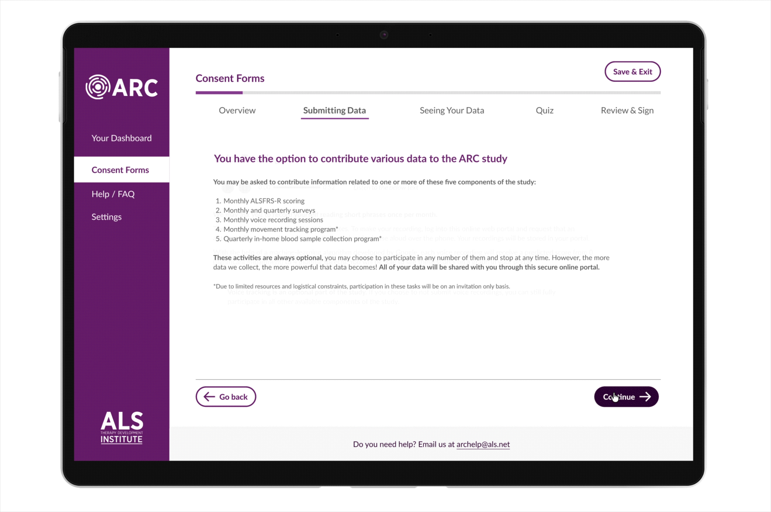
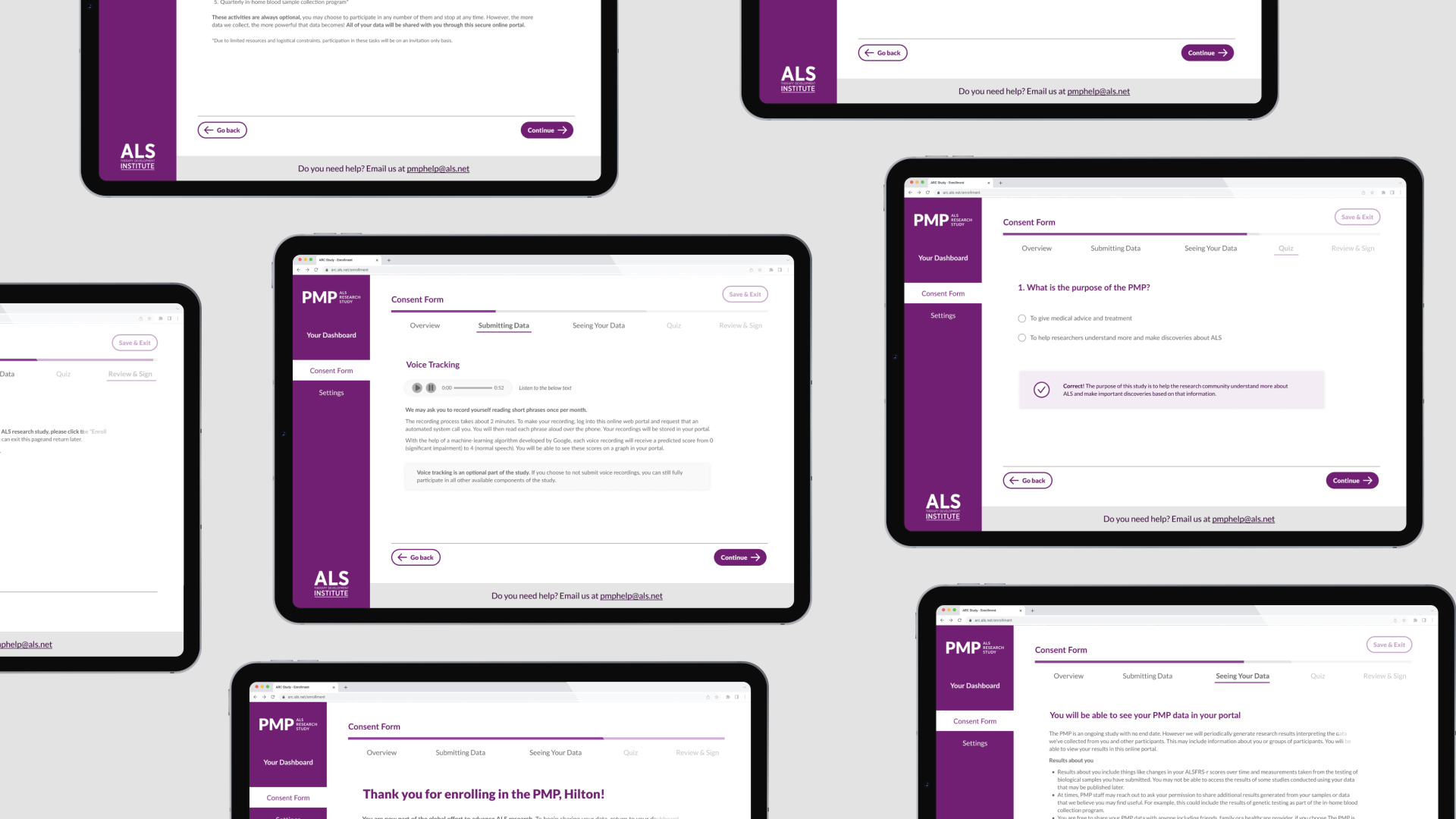
The enrollment flow was redesigned to feel intuitive and approachable. Before, participants were enrolled via email. Key improvements include a portal-based, step-by-step process with multiple save points, a clear progress bar, accessible audio and video options, and a persistent sticky navigation bar offering quick access to support via email. Together, these updates reduce friction and help users confidently complete enrollment at their own pace.
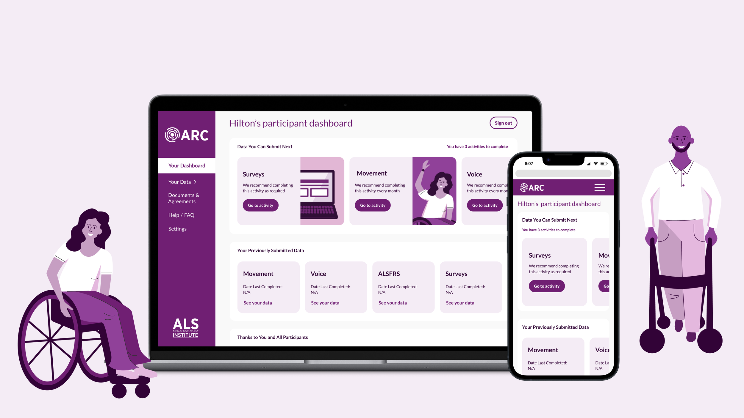
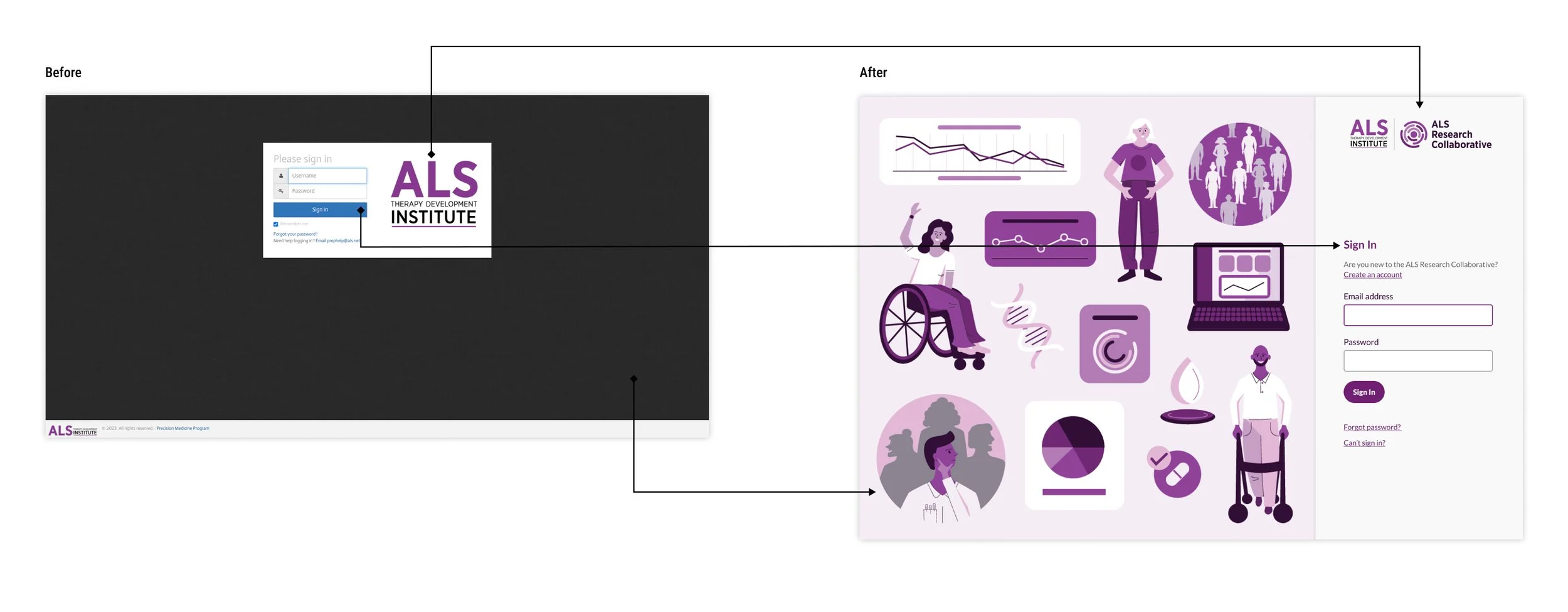
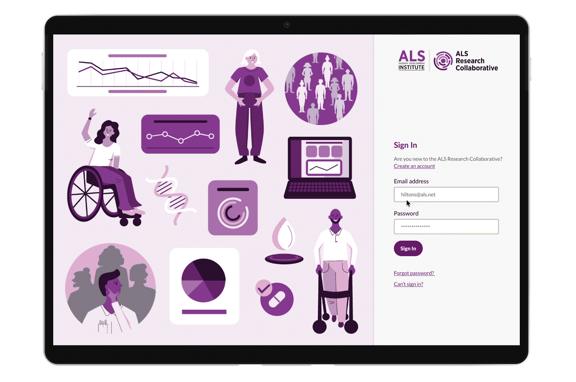
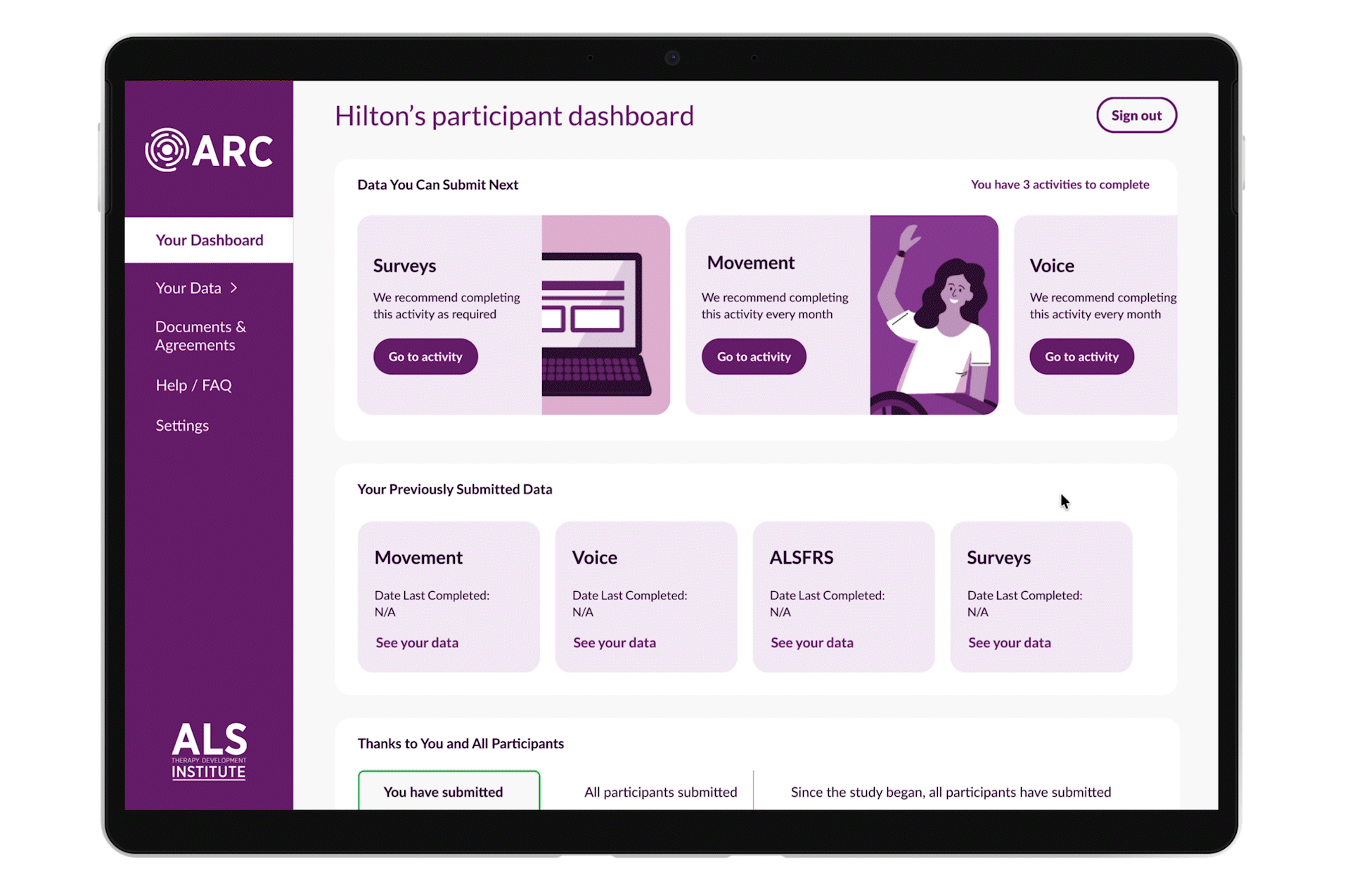
Centralized Sign-In and Unified Participant Dashboard
Participants now enter the study through a single, centralized landing page with a simplified, friendly login experience. After signing in, users are greeted by an updated dashboard that highlights upcoming tasks, displays key data at a glance, and surfaces relevant study news and updates. This makes essential information easy to find and act on.
Engaging Audio & Video Learning Tools
To better support participants, many of whom have limited mobility, the experience now incorporates multimedia alternatives to dense text. Educational content can be watched or listened to, allowing users to absorb information in the way that best fits their needs and increasing overall engagement with the study materials.
A High-Value Participant Portal
The redesigned portal enhances usability for hundreds of participants by clarifying required actions, addressing multiple user scenarios, and introducing a more intuitive information architecture. Improved update delivery keeps participants informed about study progress and reinforces the value and impact of their continued participation.
Digestible, Step-by-Step Enrollment Journey
The new enrollment workflow breaks complex eligibility and data requirements into a clear, step-by-step path supported by visual and auditory media. This approach helps potential participants understand expectations and feel confident moving forward. Within four weeks of launch, the redesigned enrollment experience contributed to a 20% increase in enrollment completions.
Deliverables
High-fidelity UI designs for enrollment, dashboard, and portal features
Low- and mid-fidelity Figma prototypes used for user testing and development
Design specifications & interaction documentation for development handoff
Revised information architecture and navigation schema
Custom illustrations and an animated explainer video supporting accessibility and clarity
Outcomes
The redesigned experience significantly improved clarity, accessibility, and engagement for individuals living with ALS.
Key Results
✓ 20% increase in enrollment completion within four weeks of launch
✓ Improved usability, reflected in participant feedback and reduced confusion during the onboarding process
✓ More meaningful communication between the study and its participants through simplified dashboards and updates
User Testimonials
“The new dashboard is great and such an improvement! It’s very simple and the changes were necessary.”
— Lori, caregiver to a study participant with ALS
“The new site is attractive and inviting to participants.”
— Stacey, participant living with ALS
What I learned
Designing with empathy, especially for users with physical or cognitive constraints, requires grounding decisions in real user feedback and prioritizing accessibility and flexibility.
Collaboration across disciplines (clinical experts, developers, users) is essential to balance scientific requirements, technical feasibility, and user needs.
Early prototyping and continuous feedback loops help uncover usability issues before they become costly to fix.
A clear, thoughtfully structured information architecture and portal navigation can dramatically reduce friction and cognitive load for users facing complex tasks.