Thio
Brand Identity & MVP Launch for a Pharma Technology Startup
Overview
Client: Thio
Role: Brand & Visual Designer (Bally Design)
Scope: Brand identity, motion design, visual system, pitch deck, MVP UI foundations
Context: Early-stage startup preparing for product and investor launch
Thio is a pharma technology startup leveraging advanced sensing, IoT-cellular communication, and cloud-based applications to improve visibility and decision-making across pharmaceutical operations. I led the creation of Thio’s foundational brand identity and launch-ready visual system, supporting the company’s MVP release across digital, product, and investor-facing touchpoints.
This work was completed while at Bally Design.
The Challenge
Thiopoly was launching an innovative medication management solution, but faced a common early-stage challenge: strong technology with no brand recognition.
Key challenges included:
A fragmented product ecosystem spanning physical hardware and digital software
A highly regulated medical space dominated by generic, utilitarian branding
The need to quickly establish trust and credibility with healthcare decision-makers
Limited resources requiring a brand system that was efficient, scalable, and flexible
The brand needed to communicate medical dependability while signaling modern, integrated technology.
My Role
Working as part of Bally Design, I led Thio’s brand and visual foundation, partnering closely with stakeholders to translate complex technology into a clear, cohesive identity.
I was responsible for:
Designing the logo and core brand mark
Defining the color palette and typography for digital and physical applications
Establishing visual principles for product, marketing, and storytelling
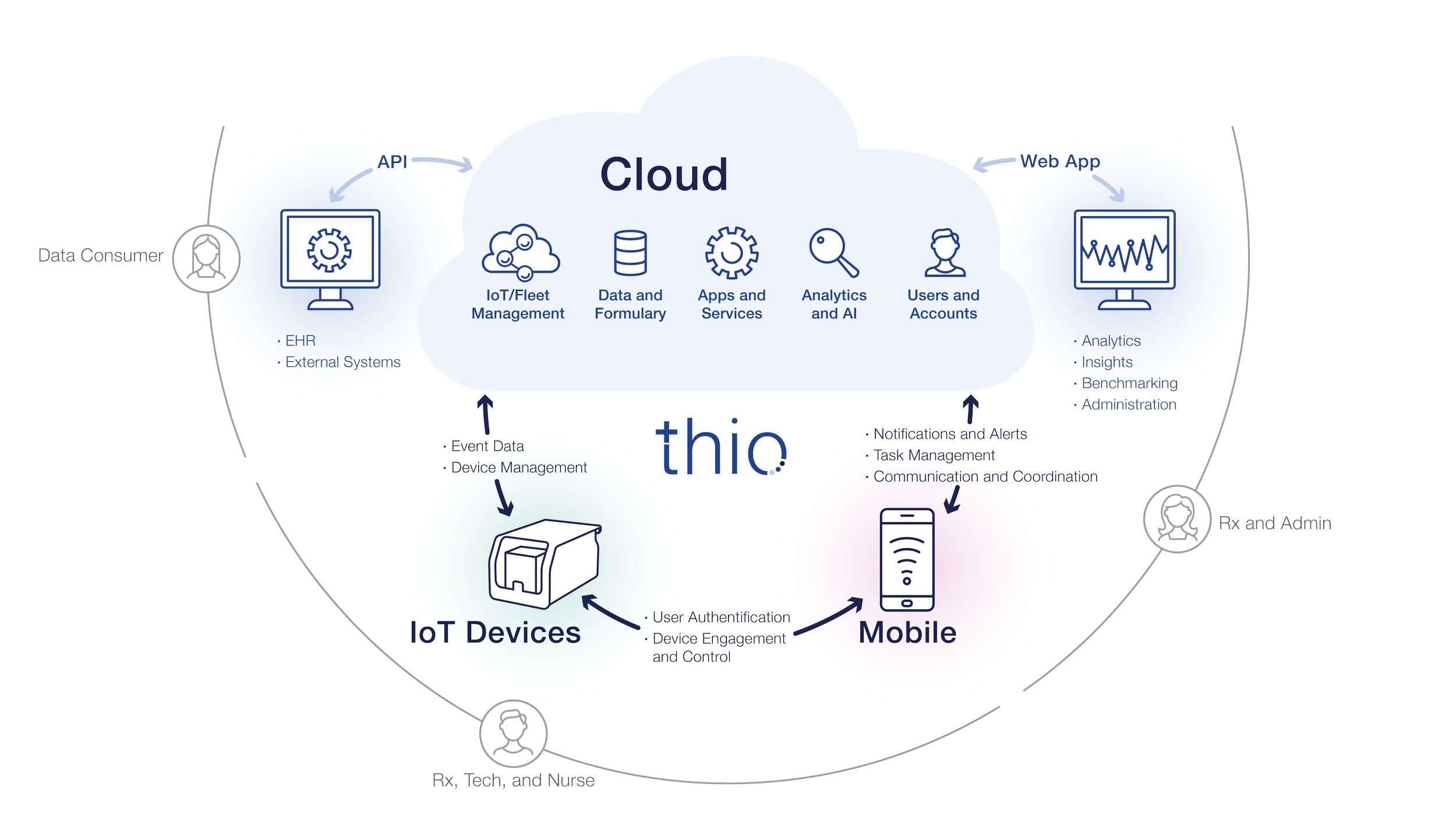
Designing pitch deck visuals, including ecosystem and service diagrams
Creating the initial UI foundations for the mobile app and desktop web app MVP
Brand Strategy & Visual Identity
The brand strategy centered on clarity, confidence, and approachability.
Strategic Goals
Signal healthcare credibility without feeling cold or generic
Visually connect physical products and digital systems
Create a distinctive identity that could stand out in overlooked medical environments
Build a foundation that could grow alongside the product
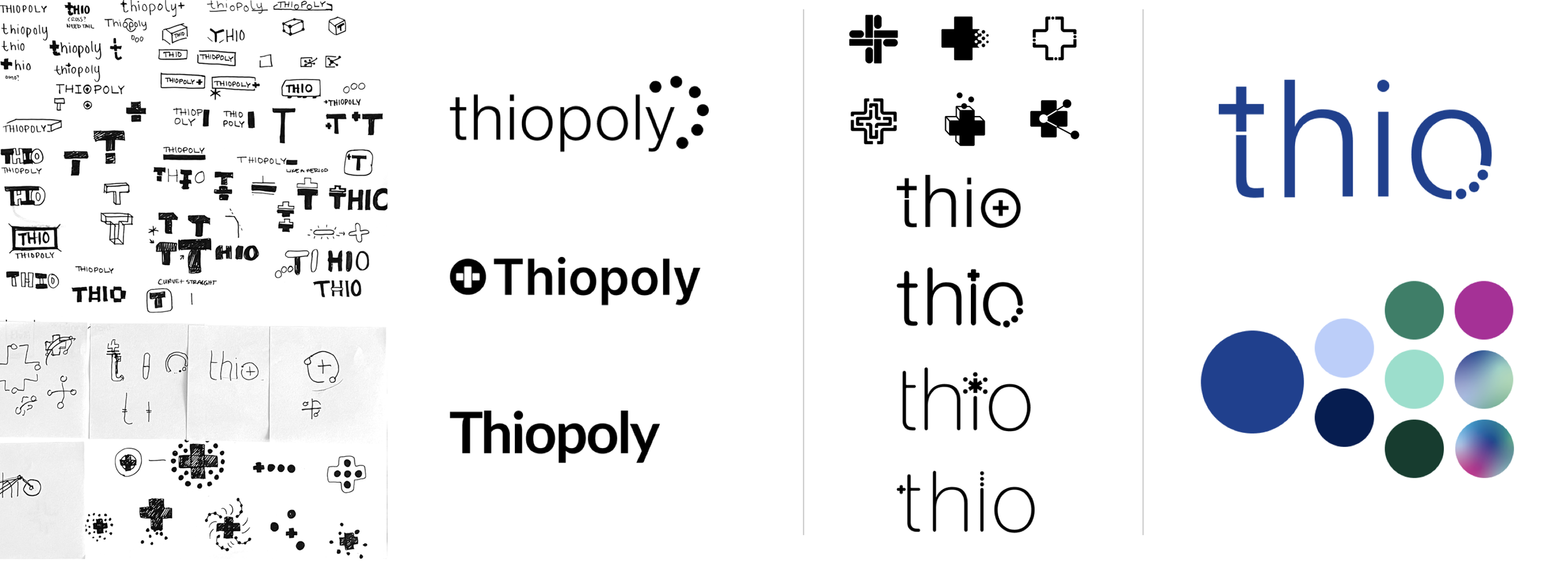
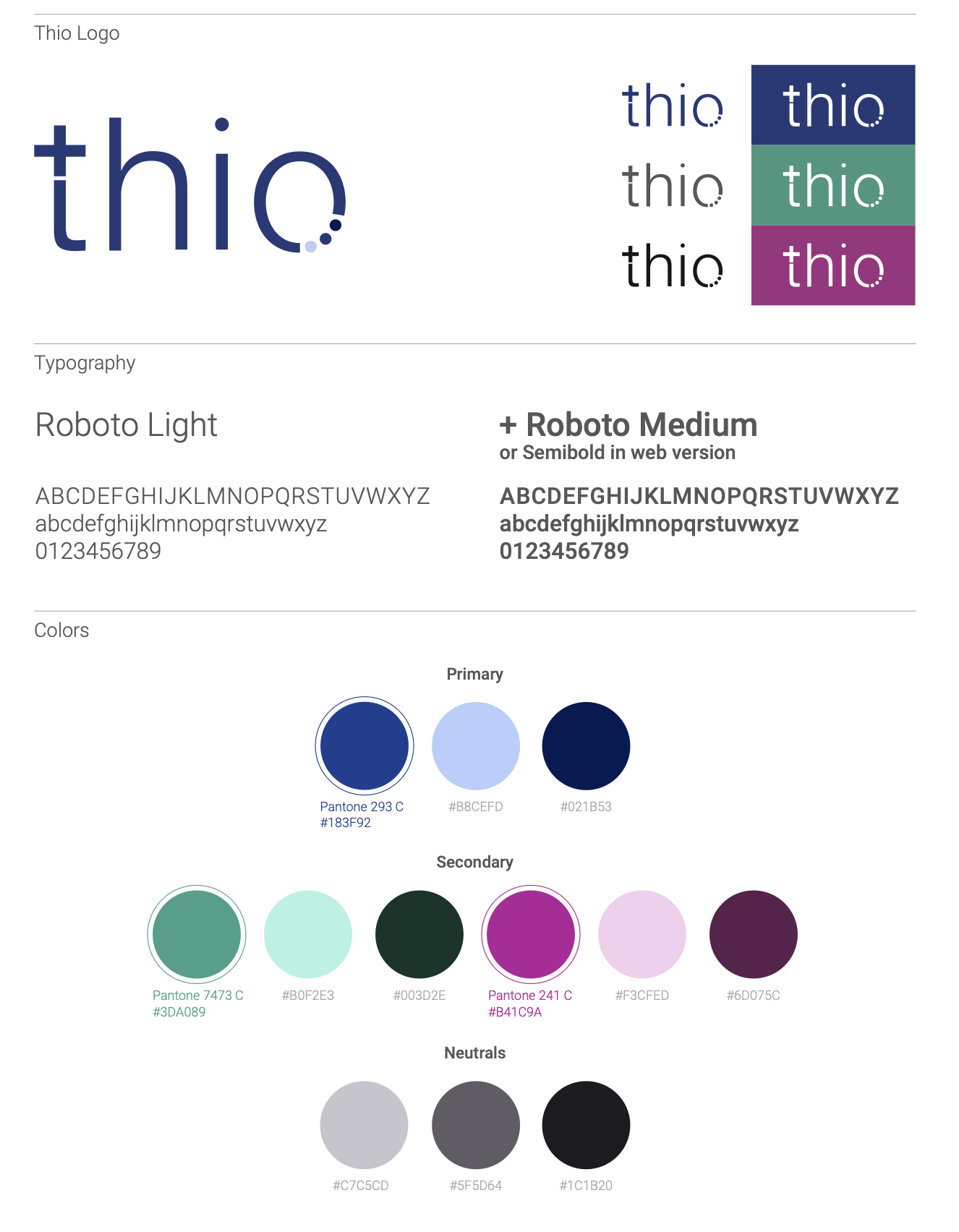
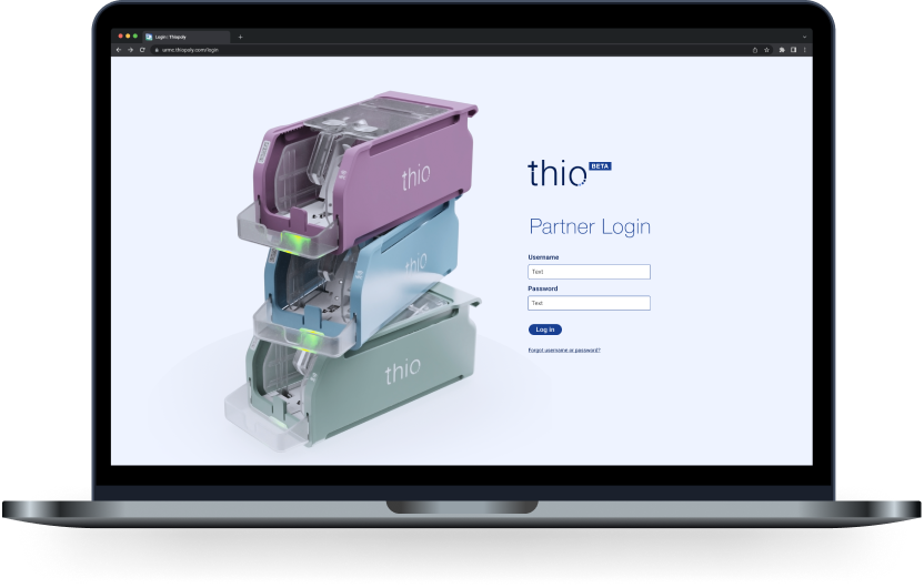
Logo Design
The Thio wordmark integrates medical symbolism directly into the typography:
A medical cross embedded within the letterform
Three dots repeated within the “o” to suggest connectivity, sensing, and system flow
Early explorations examined abstract medical symbols and dimensional forms before converging on a mark that balanced precision, movement, and clarity.
Visual System
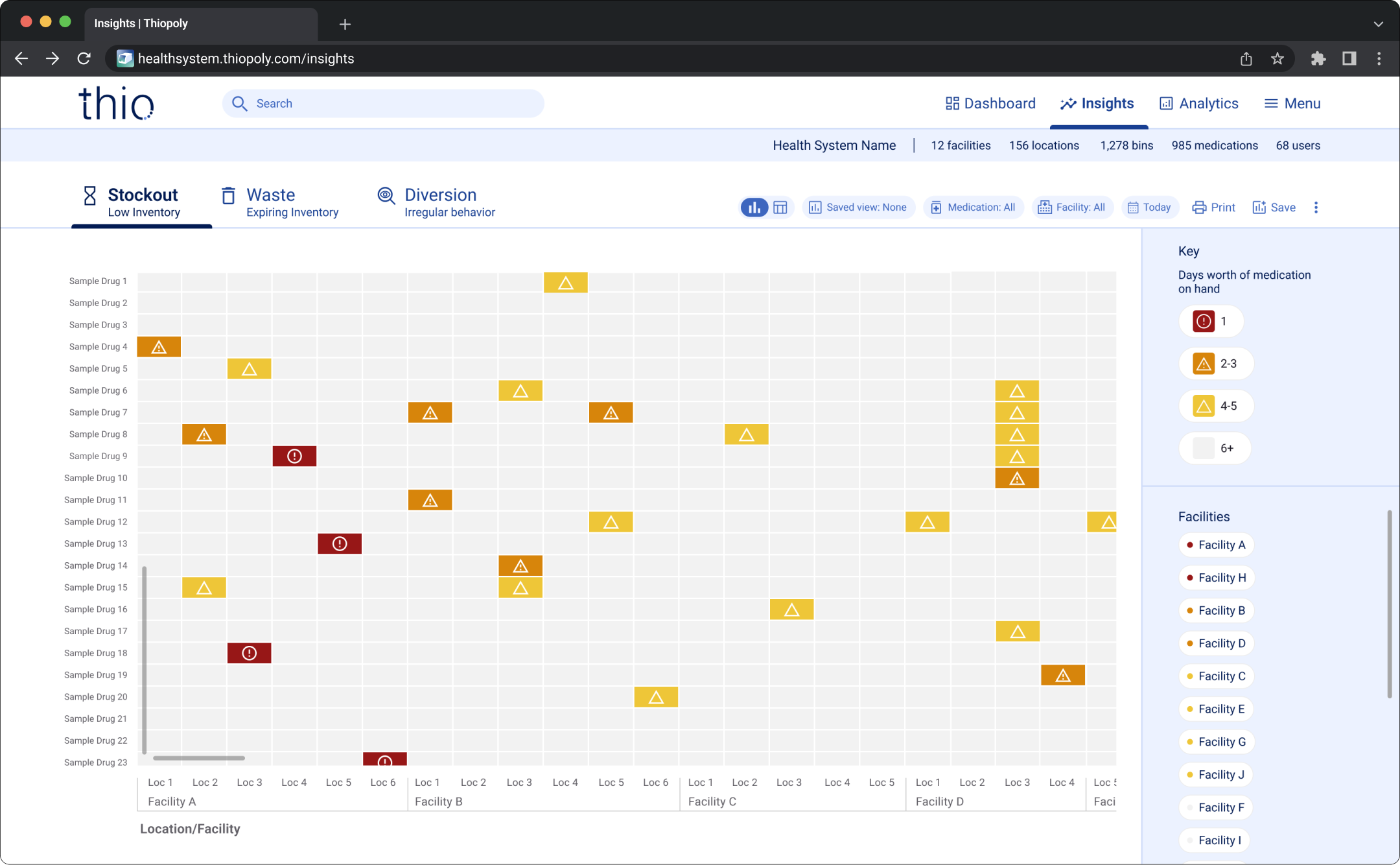
Once the logo direction was established, I expanded the identity into a complete, lightweight system:
Color palette: A vibrant, multi-hue system designed to energize sterile healthcare environments and differentiate Thio from commodity storage products
Typography: Geometric yet approachable typefaces supporting hierarchy and readability across physical and digital media
Iconography: A flexible icon system supporting product, marketing, and instructional use
Together, these elements created a visual language that felt modern, dependable, and human.
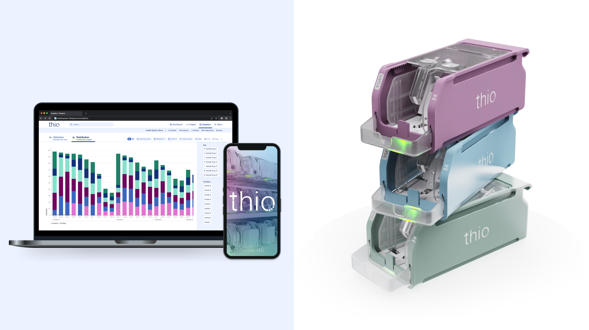
Brand in Use: Product, Website & Launch Materials
The brand system was applied across all key launch touchpoints:
Physical product context, ensuring color and logo durability on hardware
Mobile and desktop MVP UI foundations
Pitch deck design, including ecosystem and service diagrams
Single-page marketing website, designed to be conversion-focused and budget-efficient while clearly communicating Thio’s value proposition
Consistency across these touchpoints was critical to establishing early credibility.


Outcome
✓ Delivered a cohesive, launch-ready brand system spanning physical and digital products
✓ Unified diverse offerings under a single, recognizable identity
✓ Differentiated Thio within a traditionally sterile healthcare category
✓ Provided clear guidelines enabling internal teams to apply the brand consistently and efficiently
✓ Supported early-stage fundraising, product positioning, and market entry efforts
What I learned
Thio demonstrates my approach to early-stage brand creation in regulated, technical spaces. By grounding the visual system in clarity, scalability, and real-world constraints, the brand was able to establish credibility quickly while remaining flexible enough to evolve alongside the product.